More than just merchandise, the AO Shop extends the Australian Open experience beyond the court. Through bold design, vibrant colours and a distinctly summer feel, it showcases official products that connect fans with the energy, excitement and spirit of the AO all year round.
Primary Logo
Reverse Logo

Colour Logo

Mono Logo

Limited Use


Exclusion zone and Minimum Size


Retail Partner Composite Logos
The Official Partner Composite Logo presents the Australian Open and partner brand in one lock-up, promoting the association between the two brands. Where relevant, various brands will be able to ultilise their composite logo in the retial space, from AO Shop EDMs, clothing tags and onsite signage.

Please liase with Marketing Partnerships for Composite Partner and Partner Designation Logos.
For more details visit the Partner page click here.
Retail Partner Colloboration Logos
This exectuon is for brands who are not official partners of the Australian, but are collobrating with our brand.


Please liase with Marketing Partnerships for Composite Partner and Partner Designation Logos.
For more details visit the Partner page click here.

Tone of voice
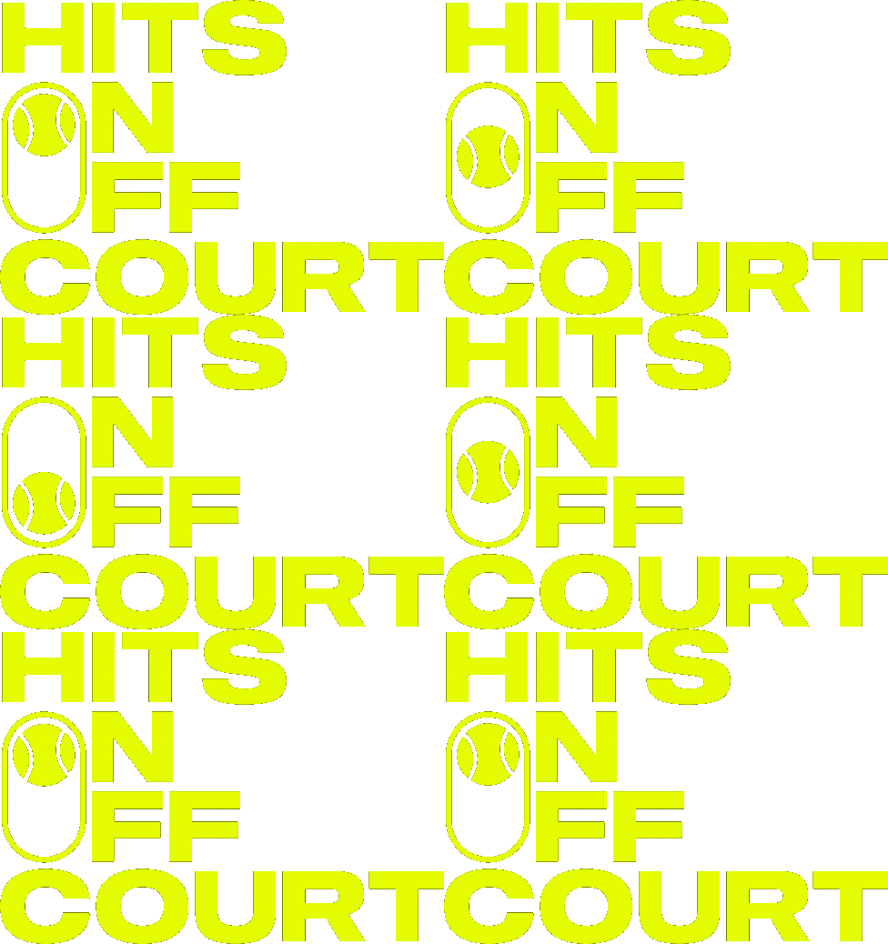
Our voice brings confidence, energy and a touch of wit to elevate our style. 'Hits On & Off The Court' is about blending lifestyle uses with tennis fandom and headlines should reflect these two worlds coming together.
NEXT STOP, STYLE.
FASHION IS SERVED
MADE BY MELBOURNE FOR YOU
STRAIGHT SETS STYLE
BEST SELLERS ARE BACK IN PLAY
LITTLE FANS, BIG ENERGY
Typography
Primary Typeface
Sequel Wide is used for AO Shop collateral. It showcases energy and dynamic movement and complements the AO Brand typeface.
Bold Semibold Medium Book
Sharp Sans No.2 plays a crucial role in ensuring a cohesive and consistent brand identity. The typeface’s flexibility in weight allows it to be used in many circumstances, from sub headline through to body copy.
For alternative typeface and system fonts click here
For digital applications, Poppins may be used for body copy only. It's a widely accessible free Google font with similar characteristics of clarity, simplicity and rounded sans serif forms.
Core Palette
Hits Different Blue
Hex:
0078FF
RGB:
0/120/255
CMYK:
100/40/0/0
Pms:
HD Blue 2195C
Copy HEX
Lime Green
Hex:
E1FF00
RGB:
225/255/0
CMYK:
25/0/95/0
Pms:
389 C / 388 U
Copy HEX
Bright Blue
Hex:
00e1ff
RGB:
0/225/255
CMYK:
55/0/0/0
Pms:
297 C/U
Copy HEX
Navy blue
Hex:
000C3C
RGB:
0/12/60
CMYK:
100/85/5/70
Pms:
282 C/U
Copy HEX
Royal Blue
Hex:
1e2886
RGB:
30/40/134
CMYK:
100/90/0/0
Pms:
Reflex Blue C/U
Copy HEX
Process Blue
Hex:
0091D2
RGB:
0/145/210
CMYK:
100/15/0/0
Pms:
Process Blue C/U
Copy HEX
Inspired by the ever-changing light on our iconic tennis court, the Core Colour Palette embraces the entire spectrum of blue that emerges throughout the day and into the night.
Functional Palette
White
Hex:
FFFFFF
RGB:
255/255/255
CMYK:
0/0/0/0
Pms:
-
Copy HEX
Black
Hex:
000000
RGB:
0/0/0
CMYK:
0/0/0/100
Pms:
-
Copy HEX


Campaign Platform
'Hits On / Off The Court' captures the spirit of AO SHOP, where performance meets lifestyle. It speaks to products that are a hit on the court and beyond it, blending the energy of world-class tennis with contemporary style. The range connects with fans whether they're courtside at Rod Laver or enjoying coffee on a street corner.

Where products appear on court, in a tennis setting.

Where products appear off court, eg, in a city setting.
Elements
From expressive brush strokes and dynamic underlines to promotional badges, capsules and ticker tape treatments, each element plays a role in adding emphasis, guiding attention and bringing personality to communications. Together, they create a vibrant, premium and unmistakably AO SHOP experience





3D Elements
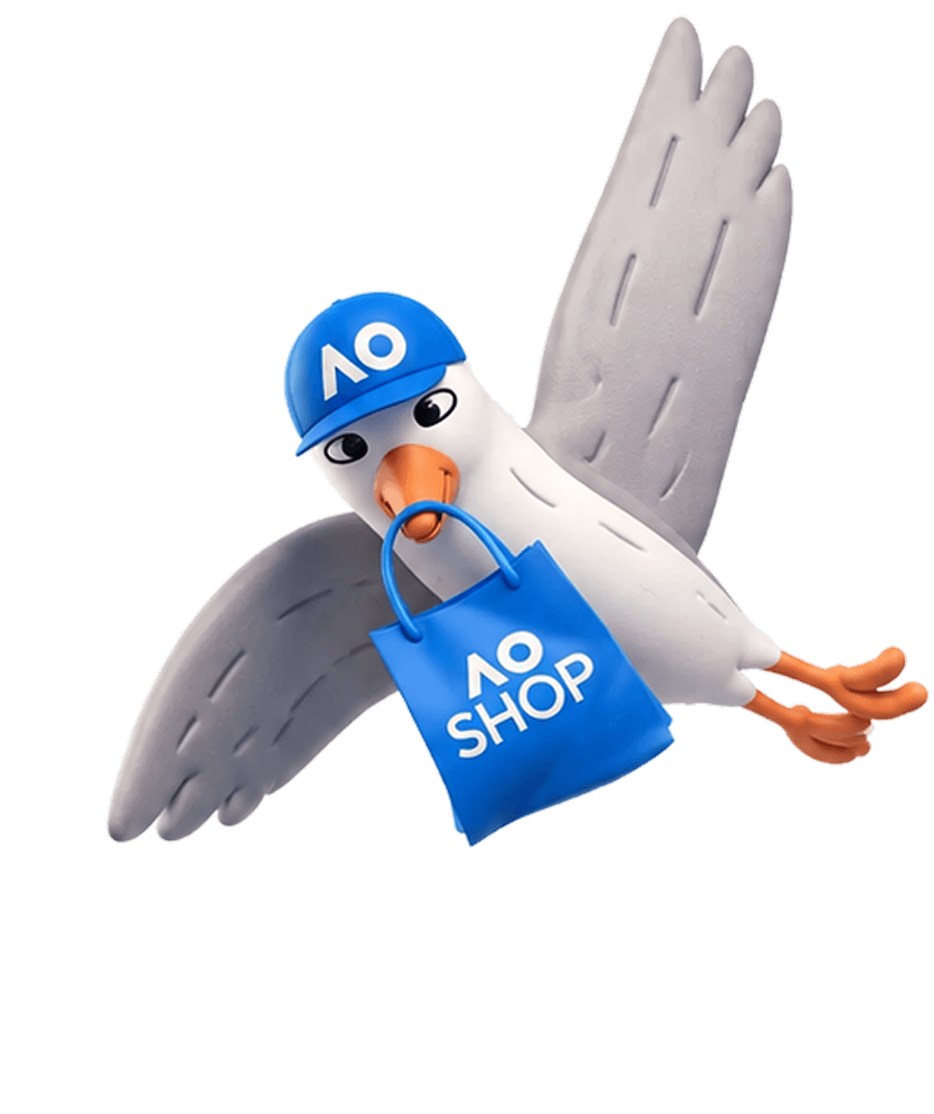
Our 3D characters bring the AO SHOP brand to life in a playful and distinctive way. From charismatic tennis balls, Stephen Seagul and Sally the Sun, they add personality and spontaneity across campaigns. These characters help create memorable brand moments while reinforcing the fun, energetic spirit of AO SHOP.


Ripped Paper Treatment
The ripped paper treatment adds depth, texture and energy to the AO SHOP visual identity. Aligned with the broader AO26 and AO27 campaign creative, it creates a strong visual connection to the Australian Open brand while bringing a sense of movement, layering and discovery to communications.


Photography
AO Shop photography celebrates real moments, real personalities and an authentic connection to tennis and pop culture. While products remain at the heart of every image, they are presented within aspirational, lifestyle-led moments that feel relevant, effortless and engaging. The style is inclusive, fun, quirky and modern, capturing genuine expression - avoiding imagery that feels fake, heavily retouched, overdressed or pretentious.
Please contact Event Marketing for any new requests.


Brand Examples
AO Shop comes to life both onsite and online with consistent application of our refined typography, bespoke colour palette and considered usage of design elements.
Please contact Event Marketing for any new requests.


