Partner
guidelines
From families soaking up the action, to music lovers at AO LIVE, foodies enjoying global cuisine, B2B professionals forging deals, and premium guests enjoying exclusive hospitality – the AO is a universe of audiences waiting to be engaged.
This is an invitation to flex your brand’s creativity within the AO brand world. Whether you’re targeting die-hard tennis fans, entertainment seekers, or corporate leaders, the AO offers a tailored platform to inspire your audience.
But first, who's your audience?
Official Partner Logo
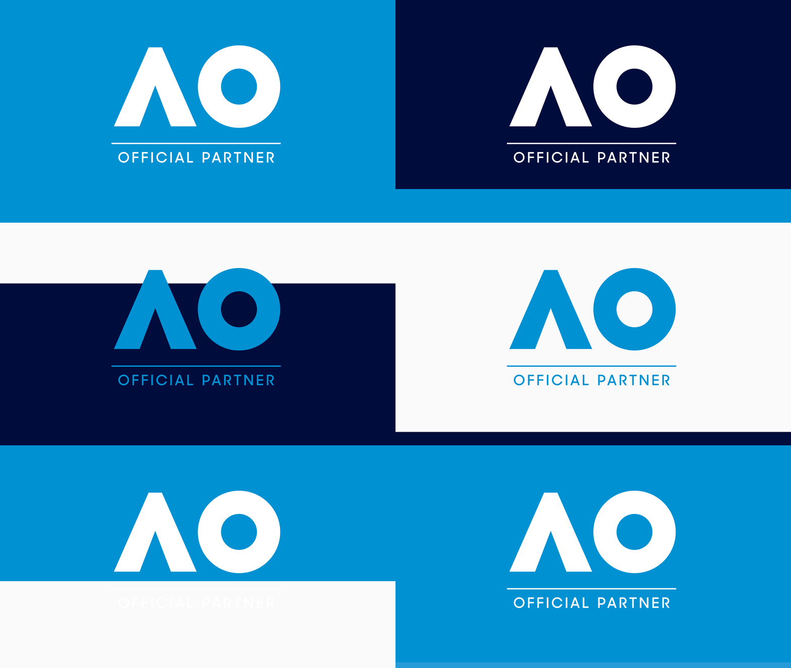
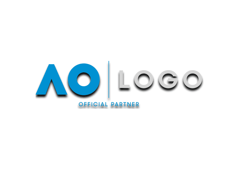
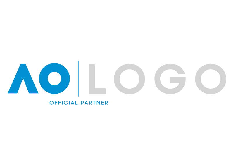
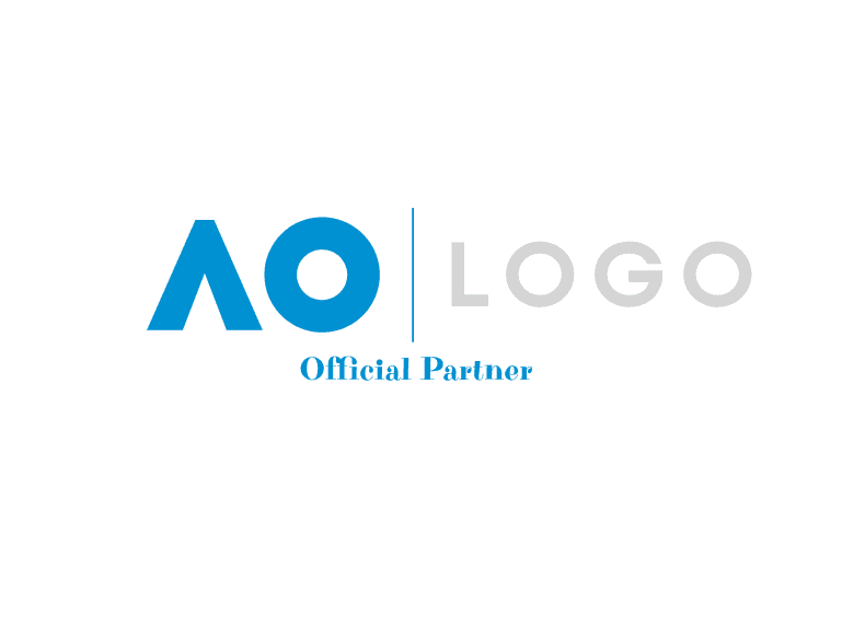
The Official Partner Logo is available for use on collateral. To ensure the integrity and clarity of the logo, please consider clear space guidelines, as well as the impact of background colours and textures. The Official Partner Logo includes the AO Logo with the wording 'Official Partner'.
Please liase with your Marketing Partnerships contact for Composite Partner and Partner Designation Logos.
Official Partner Composite Logos
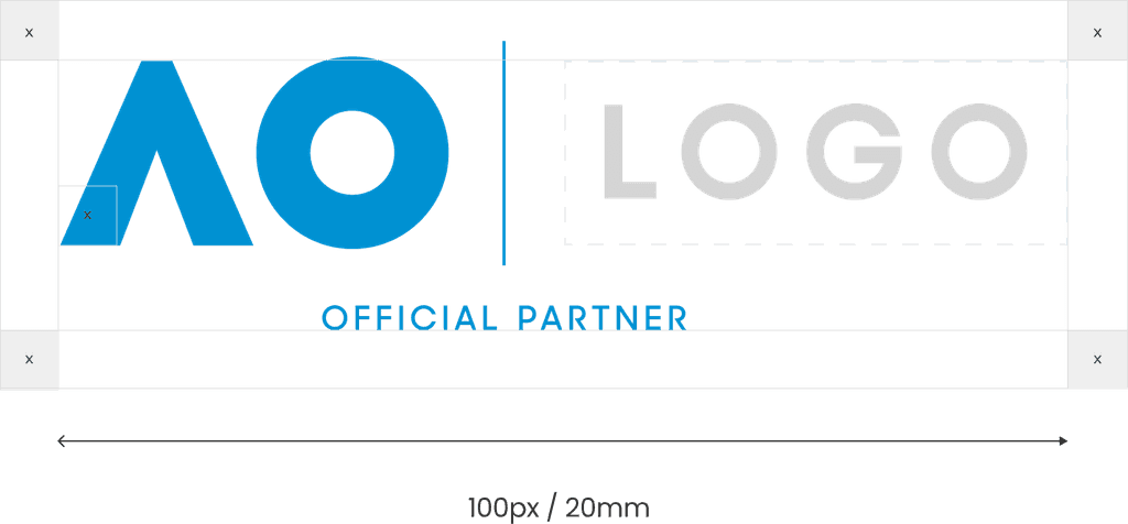
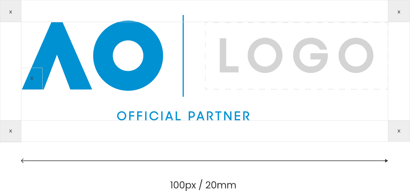
The Official Partner Composite Logo presents the Australian Open and partner brand in one lock-up, promoting the association between the two brands. The descriptor text should be centred using the divider line as anchor, except when the partner logo is narrower than 'AO', in which case the descriptor text will be centred across the entire length of the Composite Logo. Partner logos must appear on a transparent background, never in a box.
Partners must supply their logos in vector format in colour, mono and white with RGB and CMYK colour values included. Composite Logos will be supplied in full colour (preferred use), reversed and mono. For alternate colour combinations please contact the Marketing Partnerships team.
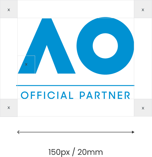
A small use Composite Logo can be used to ensure legibility when the application is small. In this case, the 'Official Partner' wording is increased in size and is centred across the entire length of the Composite Logo.
Partners designations
Partner designations need to allow for flexibility. In some cases, a single partner may use multiple designations when communicating to different audiences or markets. Regardless of the designation, the descriptor text must remain centred under the logos, using the divider line as the anchor. The descriptor text’s proportional size, style and font (Sharp Sans) must also remain consistent and never exceed the length of the composite lock-up.
Exclusion zone and minimum size
The exclusion zone is the margin of clear space that is required around our Partner Logos. The zone safeguards the legibility and impact of the logo by isolating it from other visual elements like text, graphics and imagery. No other elements can enter the exclusion zone, which is the margin of clear space equivalent to ‘x’ in the image shown.
China Official Partner Logos
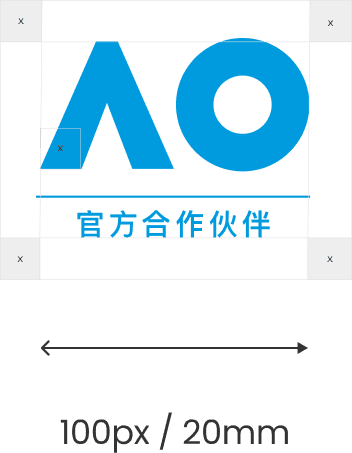
To reach our global audience, these logos may be used by Official Partners when operating in the China market. They flex to support the nuances of international markets without sacrificing brand consistency.
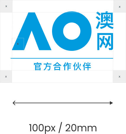
The China Official Partner Logo may be used where the audience is more likely to understand Mandarin rather than English. The characters denote 'Official Partner' across the bottom.
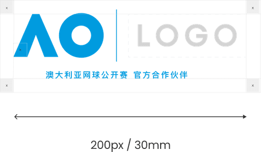
The China Composite Logo may be used by Official Partners when operating within the China market. The characters denote 'Australian Open Official Partner' across the bottom.
Exclusion zone and minimum size
The exclusion zone is the margin of clear space that is required around our Official Partner China Logos. The zone safeguards the legibility and impact of the logo by isolating it from other visual elements like text, graphics and imagery. No other elements can enter the exclusion zone, which is the margin of clear space equivalent to ‘x’ in the image shown.
Incorrect usage
The bold and lasting impact of Partner Logos comes from their consistent application. Never re-create or modify the logo in any way, including adjusting its proportions, shapes or colours. The Brand Logos must be instantly recognisable in all circumstances.
Don't use drop shadows.
Don't scale and resize the elements of the logo.
Don't use incorrect typefaces.
Don't change the colour of the logo.
Don't remove the wording under Official Partner Composite logos.
Don't use the incorrect AO logo.
Don't include extra words.
Don't distort the logo.
Don't recreate the logo.
Colour
Our colour palette is playful yet premium. Use it to remind audiences why we’re called ‘The Happy Slam’. The primary colour for AO is Process Blue
RGB 0 / 145 / 210
HEX #0091D2
CMYK 100 / 15 / 0 / 0
PMS Process Blue C / U
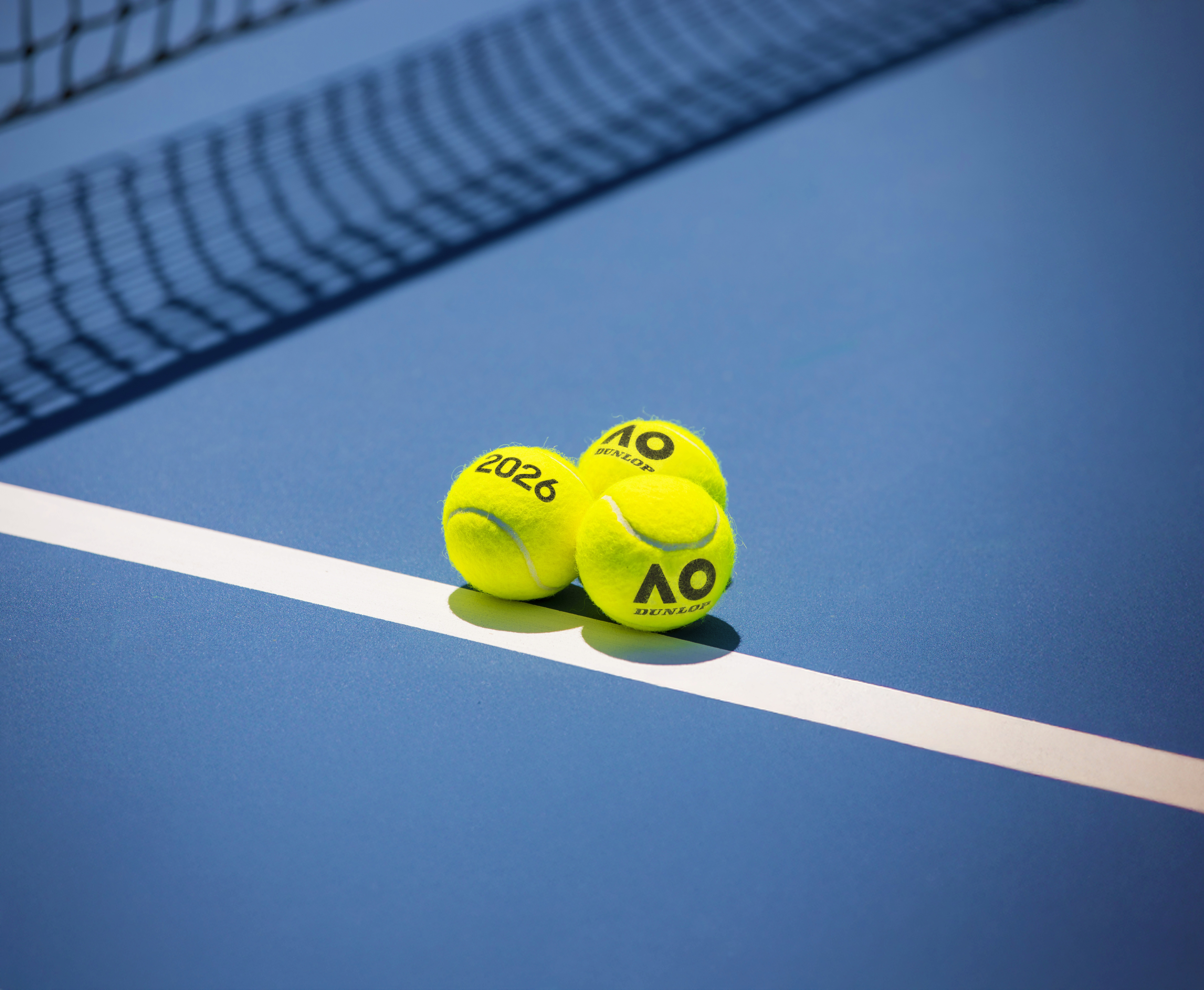
The Official AO Tennis Ball
Our Official AO Tennis Ball may be used in marketing and promotional collateral. Please contact the Marketing Partnerships team for approval and use of alternative tennis balls.
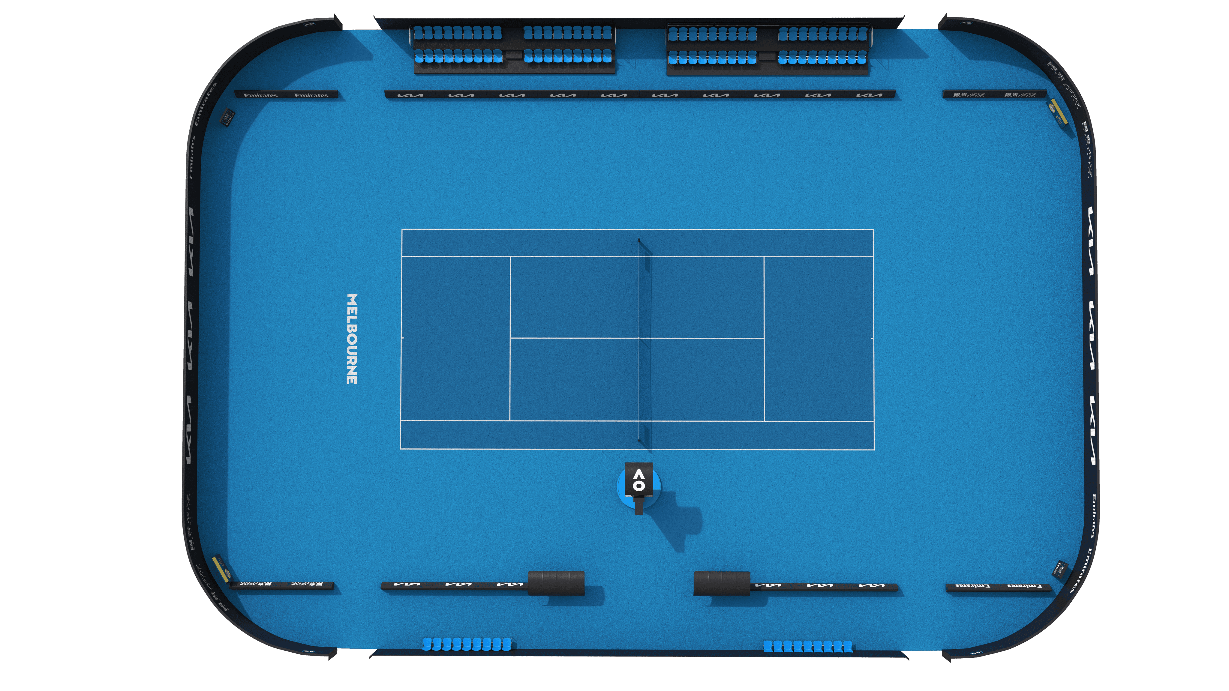
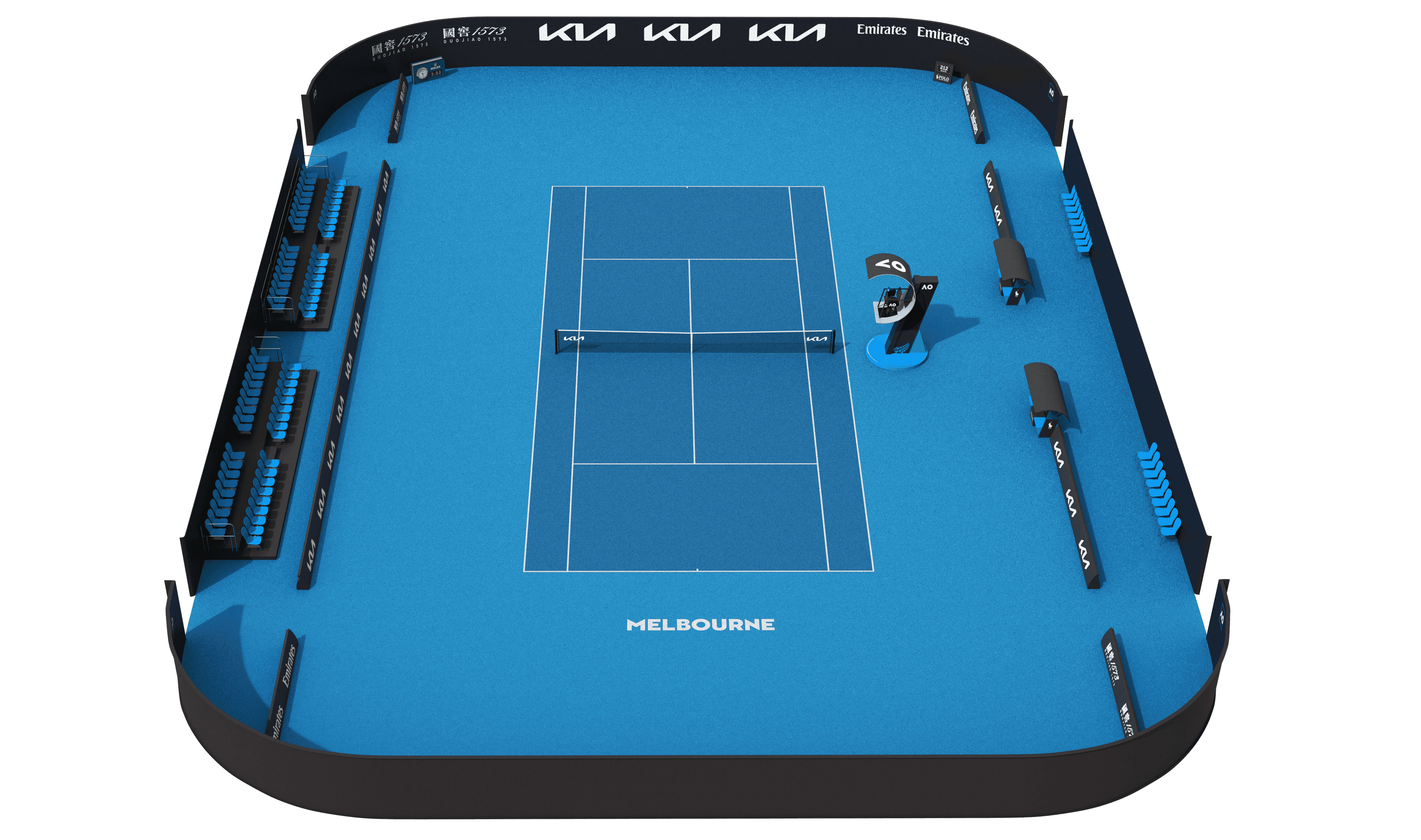
The Official AO Court
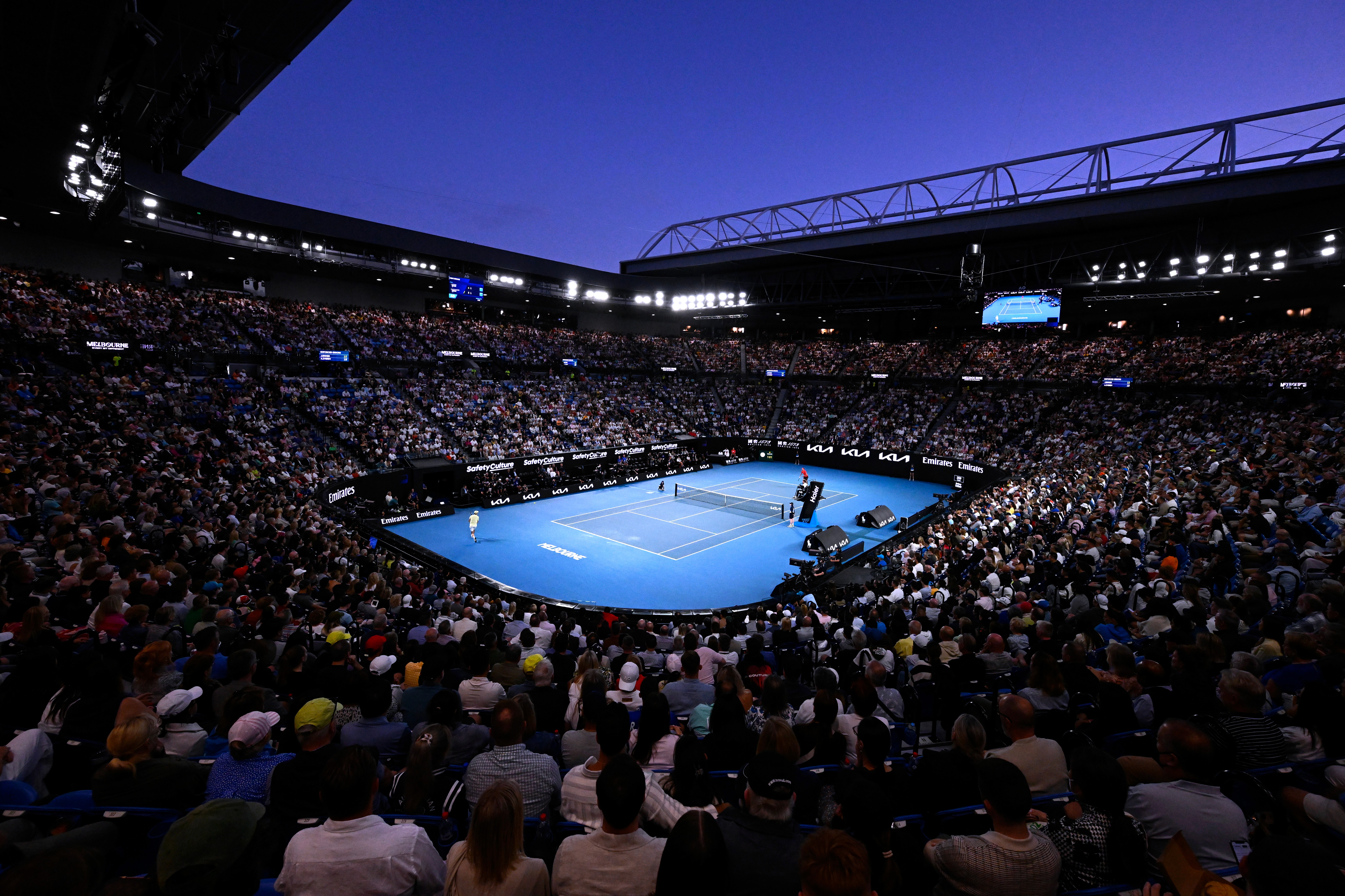
The iconic blue of our courts is unmistakable and instantly recognisable around the world.
For creative guidance and approval, please contact the Marketing Partnerships team.
Photography and videography
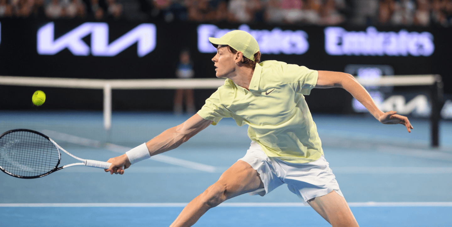
Court and arena images cannot be manipulated or altered in any way and must depict the Melbourne Park courts as seen during the event. For photography and videography, please contact the Marketing Partnerships team for guidance and approval.
Player image usage
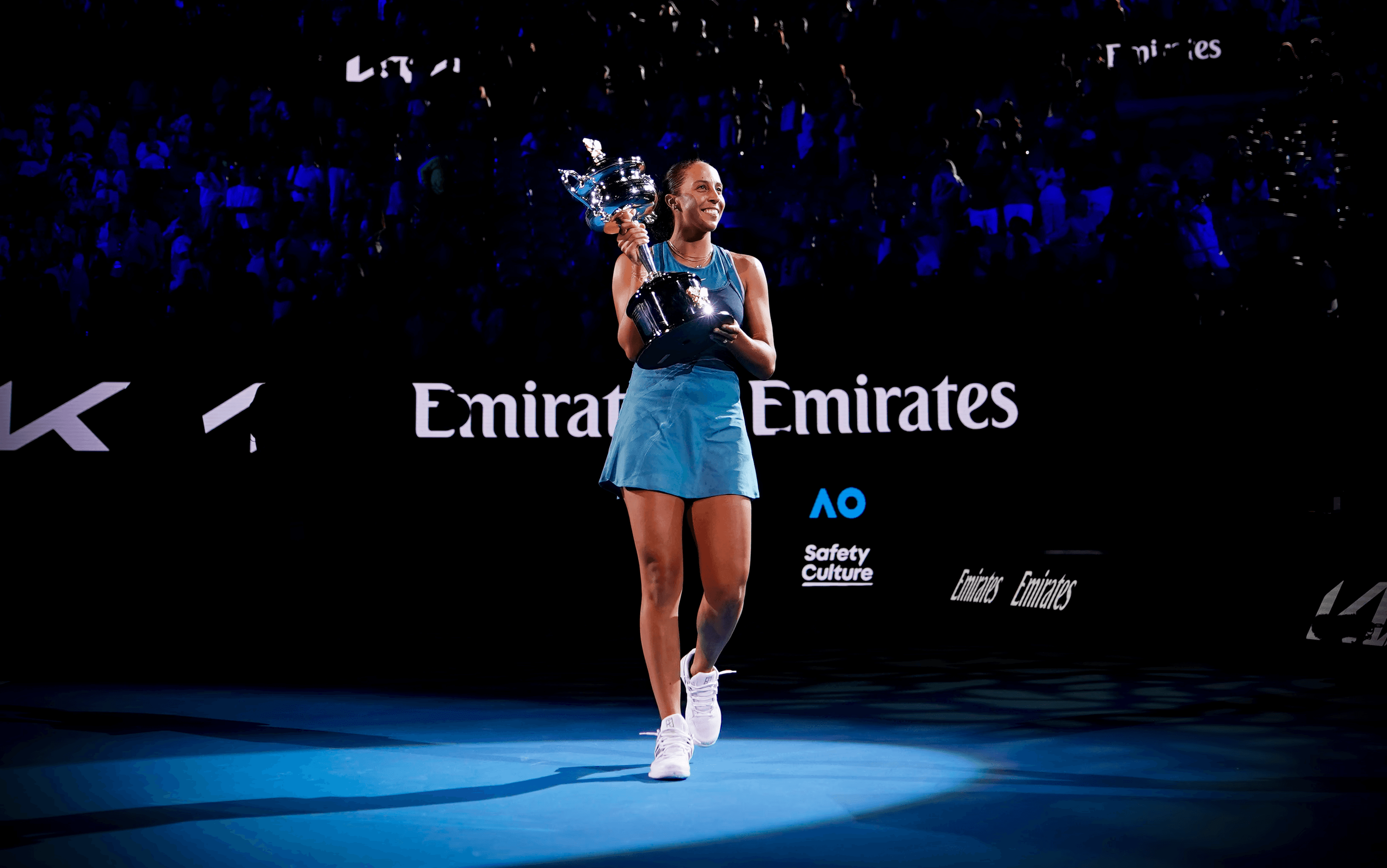
Player images cannot be used unless there is a contractual agreement between the partner and the player. Use of player imagery is subject to external approvals. Please contact the Marketing Partnerships team for guidance.
Typography
Typography is at the heart of the AO brand. Our typefaces complement the big and bold stories we have to tell about the Australian Open. Using the correct typeface is crucial for maintaining brand consistency.
Sharp Sans No.2 plays a crucial role in communicating our values, and ensures a cohesive and consistent brand identity. The typeface’s flexibility in weight allows it to be used in many circumstances, from headline through to body copy. Sharp Sans Book is the primary weight for all body copy, Sharp Sans Medium is to be used when reversing body copy in white where the text size is small.
Ping Fang SC Medium is used as the font for official designation connected to our Core Logo in the China market.
FZ Pin Shang Hei S Bold and Light, may be used for collateral in the China market.
Partner copy and messaging
As official AO [category] partner, [brand] keeps players fueled so they can go harder, longer. Because at the AO, every point #HitsDifferent.
[brand] and the AO: A winning combination. (Generic)
Approval proccess
To maintain brand consistency, ensure legal compliance and improve alignment and effectiveness, please follow our approval process.
Submit
Review
Please allow 3 business days for approval, in which the AO team may request adjustments. Allow up to 5 days during peak periods from October to January.
Iterate
AO team may request adjustments. Please ensure all assets follow usage guidelines.
