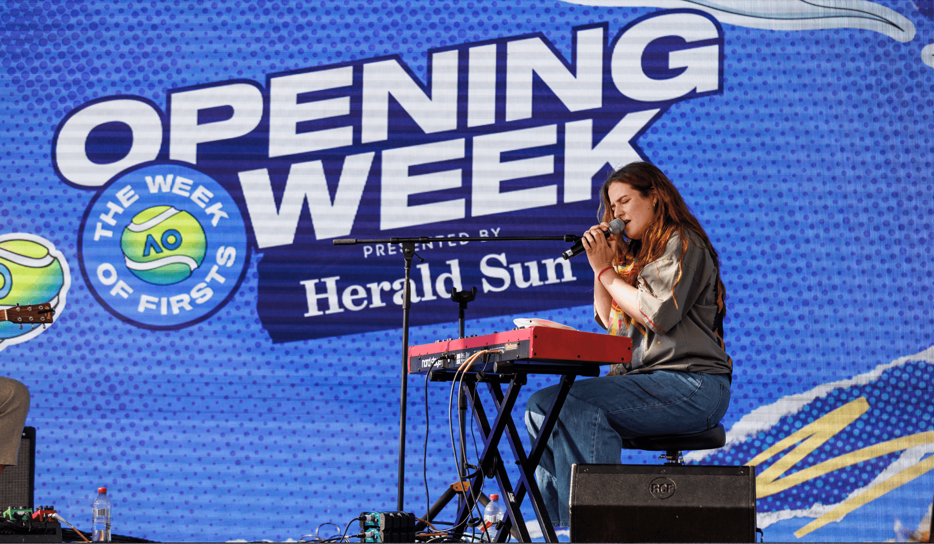
Opening Week is no longer just the warmup. It's a week packed with action and the first taste of everything great about the AO; qualifying matches, exhibition games, live music, food, kids’ days, exclusive events and superstar appearances.
This is where anticipation builds, the temperature rises, and you start to feel that the AO has truly arrived.
Logos
Primary Logo - Stacked

Primary Logo - Horizontal

Special Use Logos
No Dates


No dates or tagline


Exclusion Zone and Minimum Size


The exclusion zone is the margin of clear space that is required around the AO Opening Week logo. The zone safeguards the legibility and impact of the logo by isolating it from other visual elements like text, graphics and imagery. No other elements can enter the Logos exclusion zone, which is the margin of clear space shown in the ‘X’ box in the image shown. Minimum size requirements ensure legibility and readability across applications.


Tone of Voice
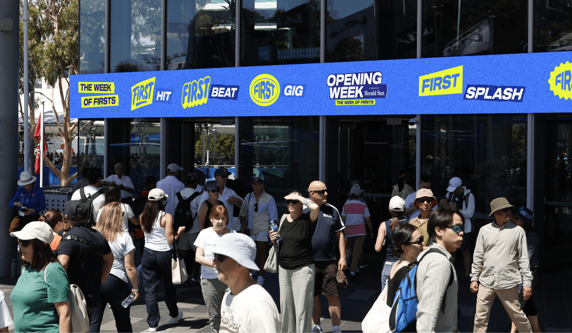
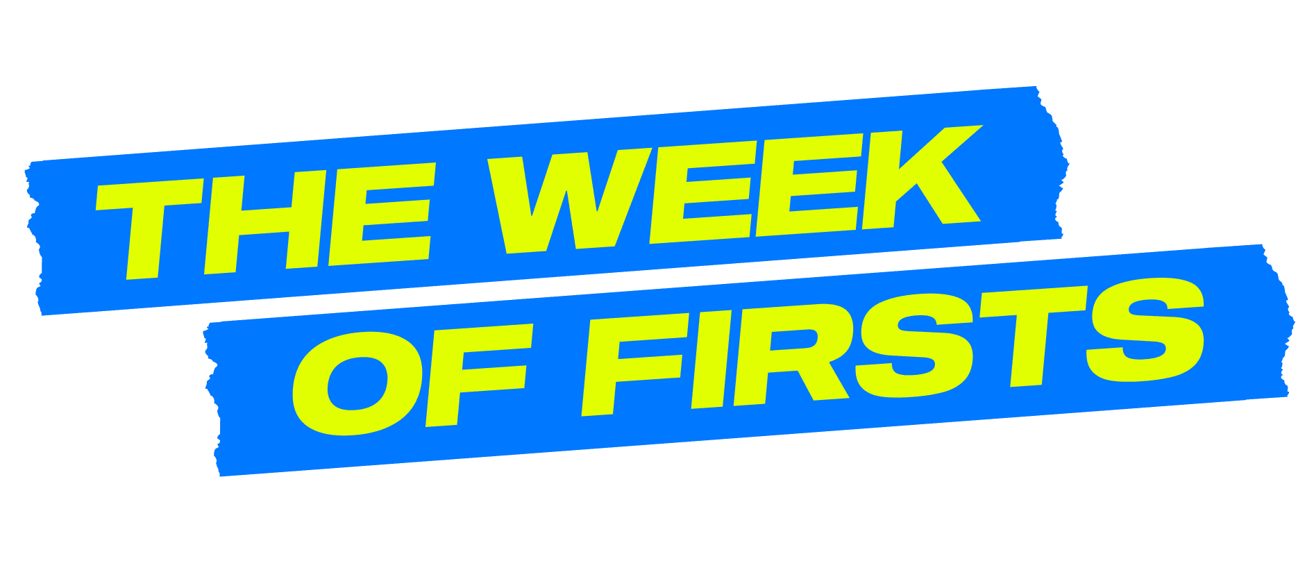
Opening Week’s tone of voice captures the imminence and energy of the AO, building anticipation for everything that’s about to happen. The theme is 'The Week of Firsts,' a punchy, playful copy system that sells the novelty and excitement of Opening Week. Keep lines short and active"
FIRST
CHEERS
ALL FOOD
& BARS OPEN
FIRST PHOTOBOMB
GET CLOSE
TO THE STARS
FIRST BEAT DROP
LIVE MUSIC DAILY
FIRST BREAK THROUGH
AO27 QUALIFIERS
FIRST DAY OUT
AO BALLPARK PRESENTED BY EMIRATES
FIRST ON COURT
OPEN PRACTICE AT ROD LAVER ARENA
Typography
Sequel 100 Wide is the primary typeface for AO Opening Week communications. Its bold, expansive letterforms convey energy, momentum and dynamic movement, reflecting the excitement and nature of the event.
Bold Semibold Medium Book
Sharp Sans No.2 plays a crucial role in ensuring a cohesive and consistent brand identity. The typeface’s flexibility in weight allows it to be used in many circumstances, from sub headline through to body copy.
Type Application
Headlines should feel fun, energetic and exciting, reflecting the dynamic spirit of AO Opening Week. While creativity and impact are encouraged, legibility should always remain the priority. Consider how supporting campaign elements, such as tape textures, brush shapes and flat illustrations, can be used to enhance messaging, add personality and create visual interest without compromising clarity or readability.







Core Palette
Hits Different Blue
Hex:
0078FF
RGB:
0/120/255
CMYK:
100/40/0/0
Pms:
HD Blue 2195C
Copy HEX
Lime
Hex:
E1FF00
RGB:
221/245/0
CMYK:
20/0/100/0
Pms:
389 C
Copy HEX
Royal Blue
Hex:
1E2886
RGB:
43/49/141
CMYK:
69/65/0/45
Pms:
287 C
Copy HEX
Bright Blue
Hex:
00E1FF
RGB:
23/205/232
CMYK:
65/0/10/0
Pms:
311 C
Copy HEX
Process Blue
Hex:
1E2886
RGB:
21/169/231
CMYK:
80/20/0/0
Pms:
300 C
Copy HEX
Navy Blue
Hex:
00103E
RGB:
0/16/62
CMYK:
100/74/0/76
Pms:
289 C / 289 U
Copy HEX
Inspired by the ever-changing light on our iconic tennis court, the Core Colour Palette embraces the entire spectrum of blue that emerges throughout the day and into the night.


Elements
Illustrations are an integral part of the Opening Week visual identity, adding energy, personality and a sense of playfulness across communications. A wide range of illustration assets is available and can be adapted across the AO colour palette to suit different applications. These elements should be thoughtfully incorporated into layouts, either as subtle supporting details or bold feature moments, depending on the context.




















Paper Ripped Usage
Ripped paper adds depth, character and texture, introducing a layered and tactile quality to the design system. These should be thoughtfully incorporated into layouts as subtle accents or bold feature elements.